




nibh placerat pulvinar. Cras nec enim quis elit blandit pellentesque. Sed sed egestas diam. Phasellus placerat et nulla et ornare. Nullam adipiscing odio elit, sit amet rutrum purus cursus a. Vivamus eros lectus, ornare non nulla eget, ultrices sagittis elit. Duis vestibulum pretium massa, at bibendum neque condimentum sed. Praesent ut viverra velit, non commodo orci. Sed placerat a nisi sed tempor. Phasellus et sapien at lacus mattis vestibulum. Praesent tempus leo in rhoncus malesuada. Phasellus ultrices dapibus justo eu semper. Etiam orci nibh, bibendum posuere mattis quis, tincidunt ut nibh. Aenean ut erat urna. Donec id turpis quis nunc tristique dictum nec vitae lectus.Praesent sit amet velit egestas, luctus tellus ut, consequat metus. Sed consectetur risus commodo urna gravida dictum. Etiam laoreet libero a felis bibendum laoreet a mattis metus. Praesent justo lorem, pretium sit amet turpis ac, elementum tincidunt ante. Duis auctor massa lorem, sed sollicitudin eros iaculis et. Vestibulum id nibh ultricies, fringilla dui non, vulputate justo. Lorem ipsum dolor sit amet, consectetur adipiscing elit. Sed malesuada consectetur elit vel euismod. Fusce ac eros consectetur, ultrices tellus sit amet, malesuada tortor. Nullam scelerisque malesuada laoreet Pellentesque dui magna, venenatis varius dui a, sodales sodales arcu. Etiam congue tortor eu suscipit fringilla. Vivamus aliquam in erat eget egestas. Pellentesque quis blandit massa. Morbi in dolor velit. Integer luctus felis lacus, quis adipiscing odio ullamcorper in. Sed viverra, tortor at porta pulvinar, libero enim adipiscing massa, id sagittis semdiam id arcu. Pellentesque habitant morbi tristique senectus et netus et malesuada .Vivamus aliquam in erat eget egestas. Pellentesque quis blandit massa. Morbi in dolor velit. Integer luctus felis lacus, quis adipiscing odio ullamcorper in. Pellentesque habitant morbi tristique senectus et netus et malesuada .Vivamus aliquam in erat eget egestas. Pellentesque quis blandit massa. Morbi in dolor velit.
fringilla. Vivamus aliquam in erat eget egestas. Pellentesque quis blandit massa. Morbi in dolor velit. Integer luctus felis lacus, quis adipiscing odio ullamcorper in. Sed viverra, tortor at porta pulvinar, libero enim adipiscing massa, id sagittis semdiam id arcu. Pellentesque habitant morbi tristique senectus et netus et malesuada .Vivamus aliquam in erat eget egestas. Pellentesque quis blandit massa. Morbi in dolor velit. Integer luctus felis lacus, quis adipiscing odio ullamcorper in. Pellentesque habitant morbi tristique senectus et netus et malesuada .Vivamus aliquam in erat eget egestas. Pellentesque quis blandit massa. Morbi in dolor velit.Vivamus aliquam in erat eget egestas. Pellentesque quis blandit massa. Morbi in dolor velit. Integer luctus felis lacus, quis adipiscing odio ullamcorper in. Pellentesque habitant morbi tristique senectus et netus et malesuada . Morbi in dolor velit.Vivamus aliquam in erat eget egestas. Pellentesque quis blandit massa. Morbi in dolor velit. Integer luctus felis lacus, quis adipiscing odio ullamcorper in. Pellentesque habitant morbi tristique senectus et netus et malesuada . Morbi in dolor velit.Vivamus aliquam in erat eget egestas. Pellentesque quis blandit massa. Morbi in dolor velit. Integer luctus felis lacus, quis adipiscing odio ullamcorper in. Pellentesque habitant morbi tristique senectus et netus et malesuada . Morbi in dolor velit.Vivamus aliquam in erat eget egestas. Pellentesque quis blandit massa. Morbi




User
Research

Content
Strategy

Sketching

Low Fidelity
Prototype
Visual
Design & Prototyping
High Fidelity
Prototype
User
Testing

• Creating Personas
• Defining user tasks & goals
• Creating Mental Models
• Testing current solutions
• Heuristic Evaluations
• Data Analysis
• Journey Maps
• Competitive Analysis
• Content Audit
• Stakeholder Interviews
• Keyword Research & Analytics
• Content Analysis & Taxonomy
• Editorial Calendar Needs
• Inbound Marketing & Social Media
• Brand, Tone and Voice Application
• Label Identification through Card Sorting
• SEO Optimization
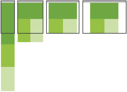
When presenting a design after a sketch session it is important to show all the template layouts side by side so it is easy to see how the content and functionality will change in each view.
High Fidelity Prototype
A high fidelity prototype should be the result after the final touches are added. Once this is created it can be taken into Governance for review. Approval at Governance leads to User Testing.
Learnings from user testing are then taken and accounted for within the designs. This starts a new cycle or iteration.

Testing


User Research
Content Strategy

Sketching

Iterative Design & Development

Testing
SAT will also be able to start their process of creating test scripts during the previous stage based on functionality documentation. Any outlying defects will be identified at this time and sent to the developer to fix.







At the beginning of the process your goal is to find out as much about the customer in relation to the goals and tasks that they might have within the scope of the project which involves :




After successfully establishing some background on users and the needs/goals to be solved for, the next step is developing the content strategy. At this stage there should be collaboration between content strategist, IA, and Usability Analyst to assess overall content needs, nomenclature, business requirements, and hierarchy.

Information Architect
Content Strategist



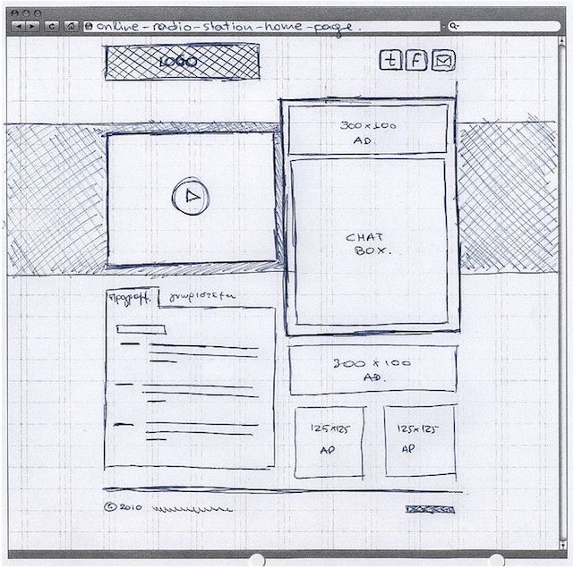
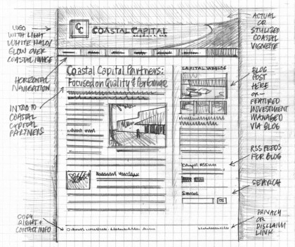
After the main content pieces are formulated or at least outlined, the team will be able to assess how to display the different content elements to best serve the users needs/tasks. This is where sketching comes in. When implementing an adaptive design based on specific template sizes, there must be a way to see how the content and functionality will progressively enhance at different breakpoints. Sketching is an easy way to ideate quickly on the different solutions and find gaps in suggested patterns before moving into more finite forms of asset development. It spurs collaboration within teams and makes critique a constant part of the preliminary design process.
Developers have an important role in this stage. They will provide input on current trends in interaction patterns, what components we already have active that we could use in certain situations, and input as to if a pattern we are suggesting is worth the effort/if there is a better way.

Deliverables
• Preliminary sketched wireframes for each breakpoint size.
• Descriptions of interaction points/animations
• Content Priority within each view
• Documentation of change in functionality at different sizes
Low Fidelity Prototype
Once sketches have defined the desired outcome at each breakpoint size, each discipline can begin work pulling together their part of the design.
Visual Design & Prototyping
After all scenarios and interaction patterns are defined in the low fidelity prototype, any new visual elements can be applied to the prototype with HTML and CSS.
A new concept within workflow that we currently don't follow is the production of web-based comps, which basically means creating a prototype and styling with HTML and CSS. Web based comps will reduce the work of the design and development team.
Think of the possible versions for each comp in a responsive design. If you have 3 versions, what may once have been 10 comps is suddenly 30. With web-based comps you reduce the need for photoshop comps. There are scripts that you can run to take screen shots of the design as they will appear at different screen sizes.
Managing multiple PSDs for each size could cause discrepancies in consistency from size to size. Web-based comps allow you to update once and everywhere, reducing the time to produce. At the end of the process you are left with a high fidelity prototype.
1
2
3
4
User Testing
Once the design is integrated into the high fidelity prototypes, user testing should be scheduled either internally or externally to assess how well the design meets the users expectation and how well it allows them to complete the main user tasks.
Deliverables
Usability
Analyst

Business Partners


Content Strategist
Business Partners
Visual Designer




Information Architect
Tools

WPA

SAT


WPA
Information Architect
Content Strategist
Visual Designer
WPA

Adaptive & Responsive Design
UX Design Q&A Responsive Layouts and Optimal Form Field Labels
http://uxdesign.smashingmagazine.com/2012/11/08/ux-design-qa-with-christian-holst/
11 Reasons Why Responsive Design Isn’t That Cool
http://www.webdesignshock.com/responsive-design-problems/
Five Responsive Web Design Pitfalls to Avoid
http://bradfrostweb.com/blog/post/five-responsive-web-design-pitfalls-to-avoid/
What is the difference between responsive vs. adaptive web design?
http://www.techrepublic.com/blog/web-designer/what-is-the-difference-between-responsive-vs-adaptive-web-design/
Understanding Progressive Enhancement Techniques in Web Design
http://www.techrepublic.com/blog/web-designer/understanding-progressive-enhancement-techniques-in-web-design/1809/
Device-Independent Design Strategy Looking Beyond Common Media Query Breakpoints
http://mobile.smashingmagazine.com/2012/10/24/beyond-common-media-query-breakpoints/
Adaptive vs. Responsive Design
http://www.rasmussen.edu/degrees/design/blog/web-design-101-adaptive-vs-responsive-design/
Adaptive vs. Responsive: Which is best for publishers?
http://www.huffingtonpost.com/garrett-goodman/adaptive-design_b_2344569.html
The Difference Between Adaptive Design and Responsive Design
http://www.searchenginepeople.com/blog/the-difference-between-adaptive-design-and-responsive-design.html
The Two Flavors of ‘One Web’ Approach : Responsive vs. Adaptive
http://www.webmonkey.com/2013/05/the-two-flavors-of-a-one-web-approach-responsive-vs-adaptive/
What does responsive web design have to do with accessibility?
https://www.ssbbartgroup.com/blog/2013/07/11/what-does-responsive-web-design-have-to-do-with-accessibility/
7 Responsive Design Tips to Revamp Your Workflow
http://mashable.com/2013/04/12/responsive-design-tips/
4 Reasons I Use Large Type
http://mikeyanderson.com/optimal_characters_per_line
Is Adaptive Web Design Or RESS Better Than Responsive Design For SEO?
http://marketingland.com/is-adaptive-web-design-or-ress-better-than-responsive-web-design-for-seo-59389
5 things you didn’t know about responsive design
http://presta-ecommerce.com/blog/5-things-you-didnt-know-about-responsive-design/
Responsive Design Device Resolution Reference
http://spirelightmedia.com/resources/responsive-design-device-resolution-reference
Responsive Navigation
http://responsivenavigation.net/
Combining Responsive and Adaptive Strategies to Solve Mobile Challenges
http://uxmag.com/articles/combining-responsive-and-adaptive-strategies-to-solve-mobile-design-challenges
ish. 2.0
http://bradfrostweb.com/demo/ish/
Contributors Jessica Nance, Vern Kesner, Joy Surles, Yazeed Atiya, Chris Chambers
Last Updated February 14, 2014


What are our options?

Advantages and Disadvantages
Which is right for Ally?
Works Cited
Works Cited
Preliminary Setup
Responsive Workflow
Articles
Adaptive Web Site Examples
http://futureinsightslive.com/las-vegas-2013/about/
http://etchapps.com/
http://www.catswhocode.com/blog/
http://teixido.co/
http://www.etsy.com/
http://easy-readers.net/books/adaptive-web-design/
Adaptive and responsive web design methods have been steadily trending since 2011. Today, we can safely say these methods are no longer trends, but standards. The bar has been raised, as it is every second within the ever-changing microcosm that we call the web, to include a special place for user sentiment. Our users define our designs. Their opinions and behavior shape and mold all of our preconceived assumptions into successful solutions.
So what is it that our users want?
Our users want to be able to view whatever they want, whenever they want, on their device of preference, without difficulty.
How can we give it to them?
The only way to meet these increasingly ambiguous expectations is to pivot our rigid design strategy to a more flexible adaptive/responsive strategy. An adaptive/responsive design will allow us to bring the best experience to the user, no matter what device size, shape or platform.
It is one of the most responsible things we could do to ensure that we will be a relevant competitor in the online space in the future. The more flexible we make ourselves now, the less work we will have to do later to adapt to new and emerging technologies.
That being said, nothing that’s worthwhile is ever easy. Moving to an adaptive/responsive design means we will have to change the way that we think and work.



Presentation Layer (CSS)
Client Side Scripting Layer (JavaScript, jQuery)
Content Layer (HTML)
Layers of Progressive Enhancement




How are these design methods similar?
Responsive Web Site Examples
http://skinnyties.com/
http://trufcreative.com/
http://www.unitedpixelworkers.com/
http://tattly.com/
http://www.currys.co.uk/gbuk/index.html
https://www.everbank.com/
http://www.garmin.com/en-US
http://thepaintdrop.com/
http://mashable.com/
http://starbucks.com/
Which is better?
There are advantages to both methods, it really just depends on the structure of the company, the type of website you are creating, and the system architecture you are working with, whether you use one, the other, or a mix of both.
Adaptive is suggested for larger corporations that feel the need for extra control and check points. It is also recommended for websites that are not starting from scratch.
Responsive is recommended for smaller websites that are starting from scratch.
A mixture of the two methods would mean having a device aware design that is fluid (conforming images and text based on device) and is optimized for device capabilities.
Which is better for Ally?
The best option for Ally is responsive design that progressively enhances, which is a combination of the two design methods.
Responsive design patterns and capabilities have advanced enough to reduce the constraints that originally caused issues.
Considering we have very few images and limited template styles, it wouldn’t be difficult for our website to become responsive. It’s all in the planning. It may take more time to implement initially, but once everything is responsive the amount of control and flexibility we will have over publishing will create a better and more cohesive experience for our users no matter what device they are on.
It’s important when moving to a responsive design to provide your employees with the tools they will need to succeed. These tools for Ally include a content management system, content & template audits, defined breakpoints, development plan, living pattern library, content & mobile first mentality, and sketching tools.
Content Management System
Content management systems need to be developed around the needs of the content team, so they can easily produce cross-platform chunks of content that are usable in any context. It needs to be flexible to include options for different media types. Content strategists must therefore plan for content with the expectation that it will exist in multiple contexts . In the past, authors might have written articles as “content blobs.” Today, it is up to content strategists to facilitate the creation of (for example) a synopsis, tag line, headline, primary story, and image for every article. The resulting CMS then provides an organized space to separate out all of those different elements.
Content and Template Audit
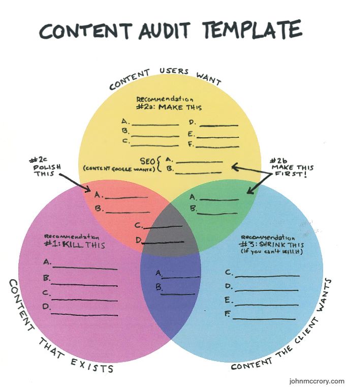
Auditing a pre-existing site is key before moving to a responsive design. A content audit will identify whether content consistently follows brand guidelines, establishes a basis for gap analysis between content you have and content you want, and prepares content for revision, removal and migration. Template audits are also important in setting the responsive redesign up for success. It will allow us to see where the inconsistencies in design and structure are, so that with the future responsive design we can eliminate the inconsistencies making the website more agile and flexible.
Breakpoints Defined by Content
Once there is an inventory of all of templates, it will be easier to define breakpoints. Breakpoints should be defined by when the content in a template breaks. Content breaks are defined when a module of text reaches a character count below 45 or above 85. These numbers are based on a rule of readability. Anything from 45 to 75 characters is widely regarded as a satisfactory length of line. Another consideration that shouldn’t be forgotten when defining breakpoints is the size of the text at different breakpoint sizes. Font size doesn’t depend on screen size; it depends on the distance between our eyes and the device you’re using. We tend to hold our phones closer to our head than our laptops, so this might warrant smaller fonts for smaller devices. Font sizes are commonly defined in ems. An em doesn’t have an absolute size. Ems allow a font to change size based on it’s container. 1em = default size for the browser you are using (usually 16px).
Living Pattern Library
A living pattern library is an online repository of UI elements and components used to assist teams in designing consistently. The markup, usage description, pattern preview (design), and any special considerations should all be defined per element/component documented. A living pattern library improves the overall experience by setting boundaries for creators.

1
2
3
4
Mobile First Mentality
Moving to an responsive workflow will mean various changes in process and project approach. Adopting a mobile first mentality will ensure that teams focus in on primary consumer needs and tasks due to the constraints of mobile design.
5
“ When a team designs mobile first, the end result is an experience focused on the key tasks users want to accomplish without the extraneous detours and general interface debris that litter today’s desktop-accessed web sites. ” - Luke Wroblewski
Content First Mentality
Content defines the structure of any good website. To develop an information architecture and content hierarchy you first need to know which content is relevant to the user. That requires research into needs, background, environmental factors, and anything else that may influence the user and their goals.
Currently our process moves in a waterfall like fashion, and content strategists start writing sometime in the middle of it. This causes little wiggle room for content strategists to change the overall design, when the content, in theory, should be the guide to shaping the design.
Design without content is decoration. It used to be that you worked on look and feel before you thought about content. But it’s actually very hard to do design without content.
A content first mentality needs to be adopted to move forward in a responsive design workflow. Part of this change is presentation-independent content. This means simply writing, without adornment. No comps. No wires. Just words. If the words are influential and meet the users needs and goals the rest will fall into place naturally.
“Chunking” content is also a new trend in the content world. It means separating each element of a piece of content into pieces that adapt easily to other devices. Usually this is used in reference to a CMS. “Blobs” are something we want to stay away from. Blobs are presentation specific instances of content that cannot be reused in another format.
6
Sketching
The various screen sizes, resolutions and device capabilities available today mean more layouts to plan for. By using sketching as a adaptive tool, you can take rough ideas, expose them to discussion and critique, refine and reformulate them, and ultimately lay the foundations on which to wireframe and prototype later in the project. It's portable, approachable and gives you the flexibility to generate iterative layouts. Sketching allows you to truly focus on user interaction and content flow, instead of how it will look.
7
What is adaptive web design?
Adaptive web design is a design method that includes the layering of defined content, CSS and JavaScript (progressive enhancement). This allows users to have the best experience possible based on the technology they are equipped with. Usually this design method entails the usage of different "templates" (S M L) that have separate code bases. The server identifies the users device and sends the correct experience based on viewport size and device capability.
Progressive enhancement is the set of guidelines that stress the accessibility of content and functionality. Each layer builds upon the next creating the optimal user experience based on the technology being used. The layers of progressive enhancement include:
What is Progressive Enhancement?
What is responsive web design?
Responsive web design is an approach that suggests that design and development should respond to the user’s behavior and environment based on screen size, platform and orientation. The practice consists of a mix of flexible grids and layouts, images and an intelligent use of CSS media queries. As the user switches from device to device, a responsive design should automatically switch to accommodate for resolution, image size and scripting abilities. This is also true within the browser.
Though many websites are now responsive, there are many stigmas still surrounding responsive design. Most of these stigmas came about alongside the introduction of adaptive design.
When responsive design was in it's infancy some issues arose that kept people from directly adopting. To account for these issues practitioners began adopting adaptive design. At the time, it solved their issues and made them flexible enough to provide device-specific experiences. Now most of the issues with responsive design are obsolete. Technology has advanced enough to resolve the issues that were once such a concern.
These issues included:
• Image re-sizing (image quality, bandwidth)
• Unnecessary downloads
• Media Queries not removing unnecessary code
• Media Queries were not supported by older devices
• RWD doesn't respect contextual usage patterns
• flexible
• adapt to device size
• breakpoints
• media queries
• design patterns
• content is ubiquitous
• can be coded so functionality matches device capability
Which method is better for Ally?
Both adaptive and responsive design methods are...
Responsive design is based on a fluid grid with fluid images, fluid media, and a single code base.

• Content (Rich Semantic HTML Markup)
• Presentation (CSS & Styling)
• Client-Side Scripting (JavaScript or jQuery Behaviors)


RWD
An adaptive design can be responsive, but a responsive design cannot be considered adaptive. The difference is in progressive enhancement and graceful degradation.
AWD

Cons
Adaptive design is a movement toward flexibility, but is not considered as flexible as a responsive design because it lacks fluidity.
The "template" that the user receives from the server is based on viewport size and capability of the device in use. If the viewport size does not match that of the original template the interface shrinks or enlarges to accommodate the device, but is not fluid.



LARGE
MEDIUM
SMALL
Issues that must be accounted for in design
There are many stigmas surrounding responsive design, most of which are myths. Below are some examples of stigmas that once impacted the use of responsive design and the solutions that now nullify their validity.
One image size doesn't fit all.
• Unnecessary downloads on small viewports or bad quality on large ones.
• Real-time image resizing is CPU and memory intensive.
• Solution : Start from small images and dynamically load bigger assets
( http://adaptive-images.com/)
Non-viewable assets are downloaded anyways
• Unnecessary downloads
• Solution : Start from the cleanest solution and progressively enhance adding what more capable browsers can use.
Media queries will not remove unnecessary code
• Unnecessary downloads of code not suitable for mobile
• Solution : Use javascript and media-queries to add, not to remove it.
Media queries are not supported by older devices
• Unnecessary downloads
• Unpredictable CSS results
• Solution : The first media query is the absence of media-queries. Use only to prevent older browsers to unconditionally load CSS.
Context of mobile = context of desktop
• RWD doesn't respect contextual usage patterns
• Solution : If you really need to, progressively enhance reacting to location not screen width, and adapt content based on proximity.

Code
Base
Code
Base
Code
Base

Content
Management
System

Blogs
Mobile
Apps
Mobile
Web
Tablet
Apps
Intranet
Microsites
Social Media

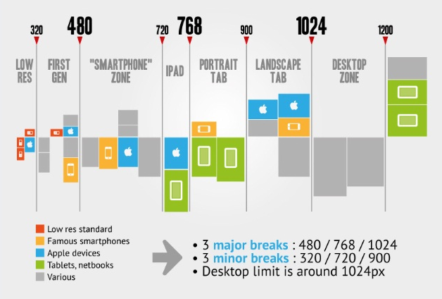
Presta E-commerce responsive breakpoint chart.







Bootstrap, Yahoo, and Apple all have good examples of pattern libraries/style guides that help them with consistency and provide useful reasoning behind each element.


1
2
3

Deliverables: Research Report Out
Content Development
• How will the content degrade gracefully? Customized CMS.
• Creation of adaptive content requires writers to craft content in multiple sizes with meaningful metadata that is written to be reused.
• Follow the rules of COPE : Create Once, Publish Everywhere
• Mobile first mentality when it comes to content creation ensures cross device compatibility... Less is more.
• Truncation is not a content strategy.
Deliverables
Content Inventory
Content Structure (defined content heirarchy)
Development Structure
In movement to a responsive design there needs to be a development structure that sets Developers up for success. This includes defining how we pull in
4
IA - Developing wires, documenting sketches, mapping user flows, defining site map and accounting for all user scenarios.
Development - Assessing needs and creating low fidelity prototype based on sketches.
Visual Design - Reading through content to understand how to visually represent, start work on graphics / skeleton of the page.
Content - At this stage, as things are coming together, content created at the beginning of the process may need tweaking to mesh with design or vise versa.
• Low-fidelity prototype with wireframes (SRG)
• High-fidelity prototype with web-based comps (Governance)
• Lower number of PSD’s make for easier maintenance and faster revisions.
• Automated screenshots can provide an visual archive of the iteration process.
• Updates to living style guide
• Breakpoint graph
• Site Map
• Strategy/Requirement outline
After a low fidelity prototype is created it should be vetted in SRG for approval before moving to Visual Design and Prototyping.
SRG
GOV
Web-based comps more effectively represent the end result because they’re already in the browser.
“Our job is to create future friendly design systems (not fixed pixel width interfaces).”
- Pon Kattera
“Day by day, the number of devices, platforms, and browsers that need to work with your site grows. Responsive web design represents a fundamental shift in how we’ll build websites for the decade to come.”
- Jeffrey Veen
"If we start talking about content in a way that gives it a form and shape, we'll have content that is more than 'first.' We'll have content that endures."
Sara Wachter-Boettcher
Author of Content Everywhere
"According to Pew internet & American Life Project, 56% of American adults are now smartphone owners. "
This becomes increasingly complex as the range of devices to design for increases daily.
According to Morgan Stanley analysts, based on the current rate of change adoption, mobile web will be bigger than desktop internet use by 2015.
With an increasingly fragmented market it has become more important than ever that our website be as flexible as possible. Adaptive and responsive design make flexibility possible and will allow us to bring the best experience to the user, no matter what size, shape or platform.

Adaptive design is based on static fixed-width layouts with multiple code bases.
Adaptive Design
Responsive Design